
In short, optimism bias is when people think things will go better than they actually do. In construction, this means people often expect projects to cost less, take less time, and have fewer problems than they really will. It’s a strange unspoken agreement that we collectively report data that understates the issues with the project. Traditional reporting aids this collective delusion by often not trending this behaviour over time.
Optimism Bias in Construction
I’m going to start this with a message of empathy; In my view, the prevalence of optimism bias in construction projects isn’t, by and large, a result of malevolent intent or incompetence. Rather, it appears to be an outcome of ingrained systemic behaviours within the industry, coupled with the fragmented distribution of accountability and risk across numerous compartments. This phenomenon, I believe, is more a reflection of the structural dynamics at play than of individual shortcomings. Take as an example a Quantity Surveyor preparing a Cost Forecast for a Main Contractor. They may find their scope of influence limited, particularly when it comes to extending project timelines. Faced with an instance of underspending in a given month, their available course of action often involves redistributing these costs over the remaining months. This practice, while subtle on a month-to-month basis, cumulatively results in a significantly distorted cost forecast. It’s not a deliberate misrepresentation, but rather a constrained response within the rigid frameworks they operate in.
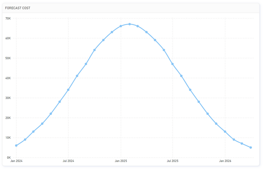
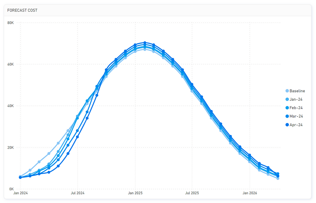
The bell curve, a familiar concept to anyone involved in construction planning, epitomises the forecasting of various elements such as costs, deliverables, man-hours, subcontracts, and material deliveries — with most KPIs naturally adopting this shape over time. This pattern mirrors the inherent ebb and flow of project activities. Operations don’t instantly achieve peak efficiency; there’s an initial phase of ramping up. During this phase, teams acclimate to their tasks, processes get refined, and resources are strategically deployed. As the project nears completion, a gradual slowdown occurs. For example, if I currently employ two workers and add two more tomorrow, it’s unrealistic to anticipate an immediate doubling of output. Additionally, if these new workers are brought into an environment where existing staff are underperforming, expecting them to immediately reach the forecasted baseline productivity is equally implausible. Productivity escalation is far from straightforward — it involves a delicate balance of learning curves, dependencies, and logistical nuances. The bell curve thus not only traces the tempo of construction projects but also highlights the subtleties involved in effectively scaling operations up and down.
Because of this consistency you can track optimism bias across any of these measures. One of the drawbacks to using Project Controls tools like Schedule or Cost Perfomance Indices is you are forced to assume that the underlying data is correct. In tracking optimism bias we operate under the premise that the data may be inherently flawed. Our objective shifts to identifying and understanding these flaws so that we can take action to correct them before they snowball.
“If You Always Do What You’ve Always Done, You’ll Always Get What You’ve Always Got.” — Henry Ford (maybe)
The Data
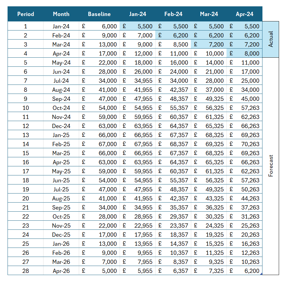
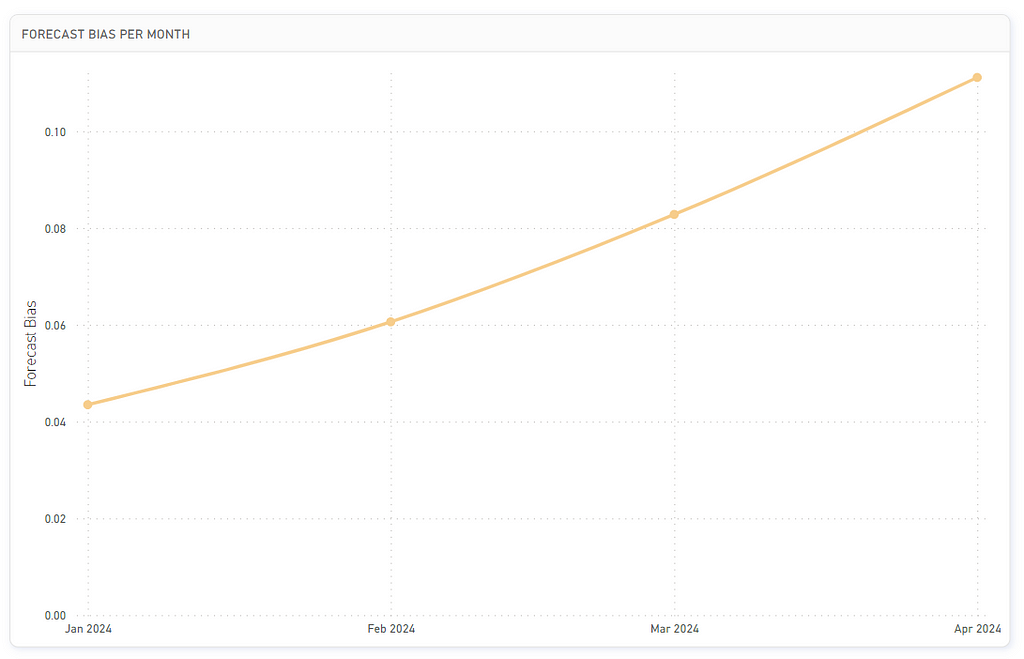
Fortunately the data we need is relatively straightforward, for each period we need to understand what was delivered vs what was planned. For this example we’ll track cost forecasts, and I have created a very convenient example of optimism bias on a project:
To calculate the forecast bias we use the following formula:
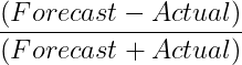
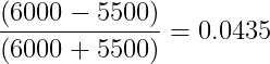
So for the month of February our previous months forecast was £6,000 spent and our actual was £5,500, therefore:
The resulting number will always be between -1 and 1, with zero representing an abscense of bias, positives demonstrating a tendency to over forecast / underdeliver, with a negative number being the inverse. By tracking this number over the course of the 4 months in our sample data we can see that the forecast bias is trending away from zero, meaning as the project progresses we are getting increasingly more optimistic with little evidence to suggest it is valid.
Further Analysis
If you want to dive in deeper into forecast biases you can refine the way you report them. These methods take into account various factors like trend adjustments, seasonality, and different weights for different time periods. Here are a few advanced approaches:
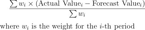
- Weighted Forecast Bias: Instead of treating each forecast error equally, you can assign different weights to different periods. For example, more recent forecasts might be given more weight if they’re considered more relevant. The formula would be modified to include these weights:
- Moving Average Bias: This method involves calculating the forecast bias within a moving window of time (e.g., the last 12 months). This approach can be useful for identifying changes in bias over time, especially in the presence of seasonality or market trends.
- Decomposition of Forecast Error: This approach involves decomposing the forecast error into different components like trend, seasonality, and irregular components. This decomposition can be done using statistical methods like time series decomposition. Each component’s bias is then analyzed separately.
- Regression Analysis: You can use regression models to understand how different factors contribute to forecast bias. This method is particularly useful when you have multiple variables that might affect the forecast.
- Tracking Signal Analysis: This is a method used to detect whether forecast errors are random or show a pattern over time. A tracking signal is calculated by dividing the cumulative sum of forecast errors by the mean absolute deviation. If this ratio falls outside of an acceptable range, it indicates a bias.
- Root Mean Square Error (RMSE) Adjustments: While RMSE is typically used to measure forecast accuracy, it can be adjusted to give more insights into bias. Adjustments might include analyzing RMSE over different time periods or under different market conditions.
As always subscribe to Shift on Medium to get articles straight to your email, or follow me and Shift on LinkedIn.
A Simple Chart to Identify Optimism Bias in your Construction Projects was originally published in Shift Construction on Medium, where people are continuing the conversation by highlighting and responding to this story.