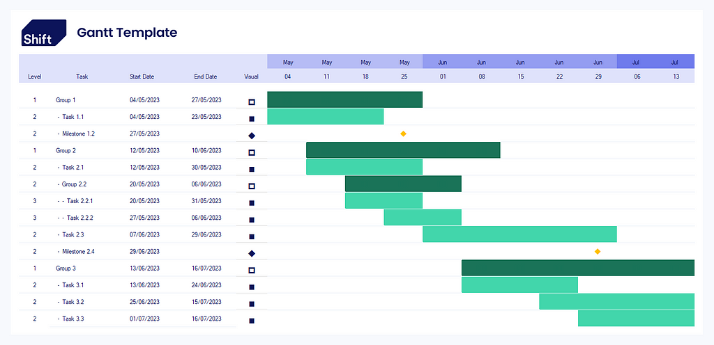
The goal at Shift is to create and implement innovative digital processes in the Construction industry. Sometimes that means creating complex data management pipelines, and sometimes that means meeting our customer where they are, and where they are is Excel.
Why?
Construction is inherently a time based industry, a project can live or die by it’s ability to maintain schedule. Therefore we communicate time based plans all the time, whether that’s master plans, document release plans, tender event schedules or anything in between. Unfortunately many of these plans don’t warrant hundreds of hours of practice and training in a complex planning tool, so we use Excel and Powerpoint to create them.
Excel in particular is great for repetitive tasks, if I have a cost plan I just set up some formulas to get my totals. Any time I want to update the cost plan I just update the changed values and all the totals work themselves out. As good as this is I very rarely see people doing the same thing for more graphical representations like a Gantt chart. In part I suspect it’s because creating an interactive Gantt in excel is a little more time consuming so I thought I’d give you a head start.
Build
So we’re going to start with a pretty ugly list of tasks along with start and finish dates:
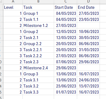
I like to keep a Level column in there so that the hierarchy is explicit, which is great for doing some fancy formatting later.
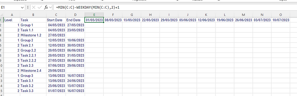
Now I need to get my dates along the columns at the top, to do this I’m going to find the start of the week for the earliest task in the Start Date column using this formula:
=MIN(C:C)-WEEKDAY(MIN(C:C),2)+1
Then use a simple formula to add 7 to the previous cell for F1:O1 to get each weeks start date. It’s worth pointing out you could always do it monthly using the EOMONTH formula, or daily by simply adding 1.
=E1+7
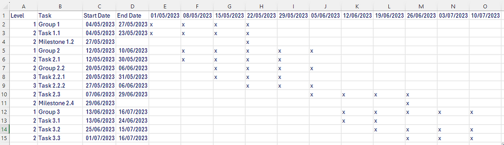
Now we have our week commencing dates that adjust based on the start dates used in the table. Next up we need to populate the cells with the relevant dates. It may seem easiest at this point to just manually fill the relevant cells that correspond to the date, but there are a few problems with this:
- There is a non-zero chance that a mistake will be made
- Updating the document becomes a headache
- Other users won’t understand that they need to edit both the date and the colour fills to update the document.
So I like to use this formula to identify whether the time between a Start & End day falls inside a given week.
=IF(OR(AND($C2<=E$1,$D2>=E$1),AND($C2<F$1,$C2>=E$1),AND($D2<F$1,$D2>=E$1)),"x","")

// In nice formatting:

=IF(
    OR(
        AND(
            $C2 <= E$1,
            $D2 >= E$1
        ),
        AND(
            $C2 < F$1,
            $C2 >= E$1
        ),
        AND(
            $D2 < F$1,
            $D2 >= E$1
        )
    ),
    "x",
    ""
)
Now you have your Gantt you can start to add some formatting to the cells. I like to include a seperate column called “Visual” which I’ll hide at a later date. This is where I add the logic for how I will render the bar so that conditional formatting can be used later. I also like to install a font which contains the Material UI icons called MaterialIcons-Regular.ttf, this helps make any symbols like milestones look a bit more modern. For the sake of the simple demo I’ll use Wingdings instead, here’s a great cheat sheet you can use to see what icons are available in the Web/Wingdings.
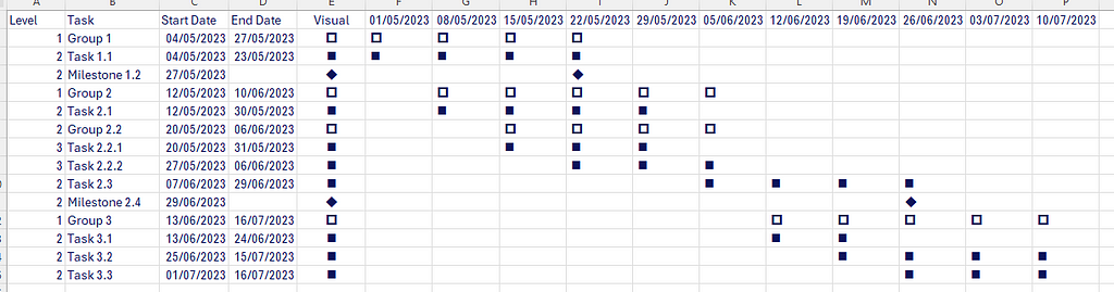
You can see I’ve replace the “X” with a reference to $E2 in the following formula, this means the icon in the matrix is now referring to whatever has been place inside the corresponding E column. I also have to make sure the matrix area font has been set to Wingdings.
=IF(OR(AND($C2<=F$1,$D2>=F$1),AND($C2<G$1,$C2>=F$1),AND($D2<G$1,$D2>=F$1)),$E2,"")
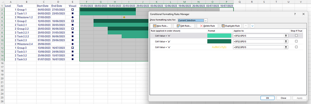
Now we’ve got our grid all worked out we can focus on conditional formatting. There are 3 rules we’ll need to apply:
- If the cell contains a hollow square we will apply dark green fill & text to show groups
- If the cell contains a filled square we will apply a lighter green to show a task
- If the cell contains a diamond we will assign a text colour of yellow, without a background fill
You can add as many icons & rules as you like, but for the purpose of this demo I’ll keep it simple. If you haven’t used conditional formatting before there is a nice walkthrough on Ablebits.
The final section I’m going to look at is the indentation of the task names. This is something you see in planning software but is not always straightforward in excel unless you know a bit of conditional formatting trickery. We will leave level 1 Task names as they are but do an indent for level 2 and a double indent for level 3.
For this we will select Column B, head of to conditional formatting and create a new rule and select “use a formula to determine which cells to format”, this lets us drive the formatting off of a different cell than the one being formatted. In the formula box I’ll put:
=$A1=2
Then set the number format to be:
- @
The @ represents the existing cell contents and the preceding spaces and hyphen provide a visual indentation.
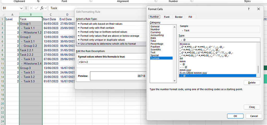
Then simply duplicate the rule and change it to $A1=3 and add additional indentation, now you have the indentation of the task list being driven by the level in level 1.
Finally I like to add a bit of formatting to extract the month from the date so I can save space and make the date a bit easier to read, use the fonts and logo from my website to ties it together and add some formatting to the grid:
You can find the example on the Shift website (Downloads & Links — Shift (shift-construction.com)). If you’re interested in adding more to your charts here’s a few ideas to get you started:
- Use a formula to get the visual character directly from the Level column
- Add a category to identify critical tasks using a red outline
- Add the task name to the end (or middle) of the bar
- Insert the Excel table directly into Powerpoint presentations as an editable object to allow for easy progress review updates
- Use the Data Bars conditional formatting to create an exact progress bar for any partial weeks
If you found this useful please follow Shift on LinkedIn for more updates, and comment below if you have any ideas.
How to make a (good) interactive Gantt chart in excel was originally published in Shift Construction on Medium, where people are continuing the conversation by highlighting and responding to this story.